At first glance, it sounds like an internet joke. But once you notice it, it becomes difficult to ignore. A surprising number of AI company logos share a visual similarity that many people describe as looking like buttholes. This observation has sparked curiosity, humor, and even serious design discussions across the tech world. Beyond the laughs, this recurring design pattern reveals deeper truths about branding trends, psychological design choices, and the pressure for conformity within the artificial intelligence industry.
The Emergence of a Visual Pattern
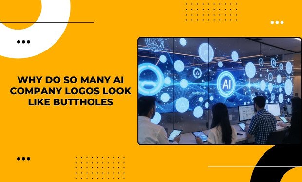
When browsing the branding of artificial intelligence startups and established tech firms, clear similarities begin to stand out. Many AI company logos rely on circular or rounded shapes, smooth gradients, and a central focal point or opening. These elements are often combined into abstract symbols meant to represent intelligence, flow, or connectivity. However, when repeated across dozens of brands, the result becomes visually familiar in an unintended way.
Once audiences become aware of the resemblance, it is hard to unsee it. What designers intend as futuristic abstraction is often interpreted by viewers as organic or anatomical. This phenomenon has turned AI company logos into a subject of playful critique while also raising serious questions about originality in tech branding.
Why Circles Dominate AI Company Logos
Circles are one of the most commonly used shapes in visual design. Psychologically, they represent unity, completeness, infinity, and harmony. For companies building artificial intelligence tools, these associations feel appropriate. AI is often positioned as a system that connects data, learns continuously, and evolves over time.
AI company logos frequently use circles to communicate trust and approachability. Rounded shapes feel softer and less aggressive than sharp angles, which helps humanize technology that might otherwise feel intimidating. Designers aiming to reduce fear around automation often choose curves to make AI feel friendly and safe.
However, when circular shapes are paired with gradients and central openings, they begin to resemble familiar organic forms. This is not intentional, but it is a predictable outcome when many designers rely on the same visual language.
Design Trends and Industry Conformity
One of the biggest reasons so many AI company logos look similar is trend adoption. When successful companies establish a recognizable design style, others follow. In competitive industries like artificial intelligence, visual conformity can signal credibility and seriousness. New startups often imitate established players to appear trustworthy to investors and customers.
This creates a feedback loop. As more AI companies adopt similar logo styles, the design trend becomes reinforced. Logo generators and branding templates further accelerate this effect by offering prebuilt designs based on what is already popular. Over time, this leads to a crowded landscape where many AI company logos feel interchangeable.
Minimalism Over Originality
Modern tech branding prioritizes simplicity. Logos must work across websites, mobile apps, dashboards, and social media icons. Simple geometric designs scale better and remain recognizable at small sizes. For this reason, many designers choose minimal shapes and limited color palettes.
While minimalism offers practical benefits, it also limits creative range. When dozens of AI companies prioritize the same design goals, originality suffers. The repeated use of circular symbols with central focal points has become a visual shortcut that sacrifices distinct identity for usability.
As a result, audiences perceive AI company logos as bland, repetitive, and unintentionally humorous.
The Role of Central Voids and Depth
A defining feature of many AI company logos is the presence of a central void or opening. Designers use this element to suggest a core of intelligence, a processing center, or a gateway to deeper understanding. Surrounding lines or shapes often radiate outward to represent data flow, expansion, or networks.
Visually, this creates depth and motion. Cognitively, it encourages viewers to interpret the logo as dynamic and intelligent. But when symmetry and soft curves are added, the brain naturally seeks familiar patterns. This leads to unintended interpretations driven by human perception rather than design intent.
This effect is an example of how abstract visuals can take on new meaning once filtered through cultural awareness and shared humor.
Internet Culture and the Meme Effect
The popularity of jokes about AI company logos is largely driven by online culture. Once a few people pointed out the resemblance, social media amplified the observation. Memes, screenshots, and side by side comparisons made the pattern obvious to a wider audience.
Humor plays a powerful role in shaping perception. What may have once been seen as clean and modern branding is now viewed through a more critical and playful lens. This shift demonstrates how audiences actively participate in defining brand meaning, regardless of original intent.
The meme has also opened broader discussions about creative stagnation in tech design and the risks of relying too heavily on trends.
Branding Beyond Visual Cliches
For AI companies looking to differentiate themselves, the ongoing joke serves as a cautionary tale. A logo is not just decoration. It is a statement of identity and values. Brands that lean too heavily on established visual formulas risk blending into the background or becoming part of an unintended stereotype.
Some AI companies are now choosing alternative approaches. Typography driven logos, asymmetrical designs, bold color choices, and symbolic imagery unrelated to circles are gaining attention. These strategies help brands stand out while still maintaining a modern and professional appearance.
Breaking away from overused motifs allows AI company logos to communicate uniqueness rather than conformity.
What This Says About the AI Industry
The similarity of AI company logos reflects a deeper tension within the industry. Artificial intelligence is associated with innovation, disruption, and creativity. Yet its visual identity often appears cautious and repetitive. This contrast highlights how emerging industries can struggle to balance experimentation with credibility.
The butthole logo phenomenon is humorous, but it also underscores the importance of intentional design thinking. As AI continues to shape the future, its branding will play a key role in how people relate to and trust the technology.
For more insightful analysis on technology trends, digital culture, and branding in the AI era, visit Infoproweekly and stay ahead of the conversation.